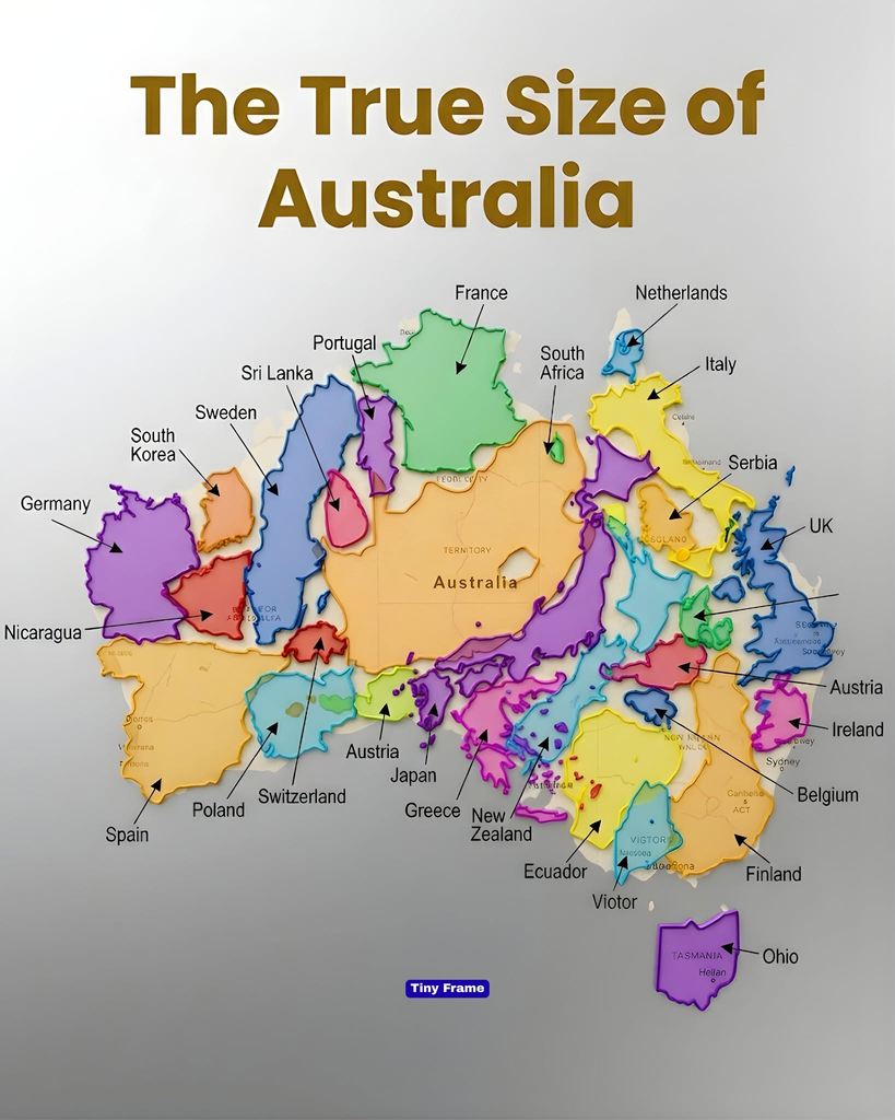
Australia occupies a unique place on the world map. It is a country, a continent-sized landmass, and one of the largest nations on Earth. Yet its true scale can be difficult to appreciate until you compare it with places you already know.
A colorful map comparing Australia with familiar countries offers an intriguing visual introduction. But the real story goes beyond the shapes shown in the illustration. Australia’s enormous area, diverse landscapes, and vast distances help explain why its geography is so remarkable.
How Big Is Australia?
According to Geoscience Australia, Australia’s total area is approximately 7.69 million square kilometers, or about 2.97 million square miles.
That makes Australia the world’s sixth-largest country by area, behind Russia, Canada, China, the United States, and Brazil.
Australia also accounts for roughly 5% of the world’s land area, according to the same government source.
Its size is particularly striking because Australia is the smallest continental landmass, even though it is larger than many countries that appear prominent on conventional world maps.
The combination of a vast area and a relatively isolated geographical position makes Australia a fascinating subject for anyone interested in world geography.
How Does Australia Compare With Other Countries?
Numbers make Australia’s size easier to understand than a colorful illustration alone. Here are several useful comparisons using approximate total areas.
| Country | Approximate area |
|---|---|
| Australia | 7.69 million km² |
| France (metropolitan France) | 552,000 km² |
| Germany | 358,000 km² |
| Japan | 378,000 km² |
| United Kingdom | 244,000 km² |
| Netherlands | 42,000 km² |
These rounded figures illustrate just how large Australia is. Its area is approximately 14 times that of metropolitan France, 20 times that of Germany, 20 times that of Japan, and more than 30 times that of the United Kingdom.
The precise ratios depend on which territories and area definitions are included. Australia’s figure includes its states, territories, and islands, while the French comparison above refers specifically to metropolitan France.
These comparisons also reveal why a map filled with smaller country outlines can be so compelling: several familiar countries could occupy only a portion of Australia’s total area.
However, a visual overlay should use accurately scaled outlines before being treated as a precise comparison.
Why Does Australia Look Different on Different Maps?
One reason people misunderstand the size of countries is that the Earth is curved, while most maps are flat.
Cartographers use mathematical systems called map projections to represent the Earth’s surface on paper or a screen. Each projection involves compromises.
The widely used Mercator projection is valuable for navigation because it preserves local angles and directions. However, it increasingly exaggerates the apparent area of places farther from the equator.
As a result, countries and regions in northern latitudes can appear much larger relative to places near the equator than their actual areas justify.
The United States Geological Survey explains that no flat map can simultaneously preserve all of the Earth’s true directions, distances, areas, and shapes.
This does not mean every world map is inaccurate or useless. Different projections are designed for different purposes. An equal-area projection, for example, is useful when the main goal is comparing the relative sizes of countries or continents.
Australia’s size is best understood through reliable area measurements or a properly designed equal-area map, rather than judging the size of a country solely by its appearance on a familiar world map.
A Huge Country With Remarkably Different Landscapes
Australia’s large area encompasses an extraordinary range of environments.
The continent includes tropical landscapes in the north, temperate regions in the south, mountain ranges in the east, and extensive arid and semiarid areas across the interior.
The Great Dividing Range stretches along much of the eastern side of the continent. Farther inland, large areas are characterized by dry landscapes, sparse settlement, and long distances between communities.
Australia is also home to the Great Barrier Reef, a vast coral reef system off the northeastern coast, as well as unique wildlife and ecosystems found nowhere else in the same combination.
This variety helps explain why Australia’s size is more than a statistic. Its geography influences agriculture, transport, settlement patterns, conservation, and the way people travel across the country.
Why Does Such a Large Country Have So Much Open Space?
Although Australia is enormous, its population is concentrated in particular regions rather than spread evenly across the continent.
Many Australians live in coastal cities and surrounding urban areas, including Sydney, Melbourne, Brisbane, Perth, and Adelaide.
The interior contains extensive areas with low population density, partly because of limited rainfall, challenging environmental conditions, and the practical difficulties of supporting large populations far from major infrastructure.
This distribution creates a striking contrast: Australia has an enormous land area, but many of its residents live relatively close to the coast.
The difference between land area and population distribution is important when interpreting maps. A country can be geographically vast without having people, roads, or cities evenly distributed across it.
Is Australia Larger Than Europe?
The answer depends on what exactly is being compared.
Australia covers approximately 7.69 million square kilometers. Europe, considered as a continent, is generally estimated at around 10 million square kilometers, although the exact figure depends on how its boundaries are defined.
Therefore, Australia is not larger than Europe as a whole.
However, Australia is larger than many European countries individually and can exceed the combined area of some selected groups of countries.
This distinction matters because a graphic comparing Australia with a collection of European countries may create a different impression depending on which countries are included.
A reliable comparison should identify the boundaries, list the places being compared, and use consistent area measurements.
What the Image Gets Right—and What to Check
The image’s central message is useful: Australia is much larger than many familiar countries, and visual comparisons can challenge our assumptions about geography.
However, some of its labels appear misplaced or refer to locations that are not countries. Ohio, for example, is a state in the United States. Other labels do not appear to match the outlines they indicate.
The image should therefore be treated as an illustrative graphic, not a verified geographic dataset.
For a precise comparison, consult official area statistics or use a mapping tool that preserves relative area. The Australian government’s Geoscience Australia website provides authoritative information about Australia’s dimensions and state and territory areas.
Frequently Asked Questions
1. What is Australia’s total area?
Australia covers approximately 7.69 million square kilometers, or about 2.97 million square miles, according to Geoscience Australia.
2. Is Australia the largest country in the world?
No. Australia ranks sixth by area, behind Russia, Canada, China, the United States, and Brazil.
3. How many times larger is Australia than the United Kingdom?
Using approximate total areas, Australia is more than 30 times the size of the United Kingdom. Exact ratios vary slightly depending on the area definitions used.
4. Is Australia bigger than Europe?
No. Europe as a continent is generally estimated to cover around 10 million square kilometers, compared with Australia’s approximately 7.69 million square kilometers.
5. Why do countries look different in size on world maps?
Map projections transform the curved Earth into a flat representation. Different projections preserve different properties, so apparent country sizes can vary. Equal-area projections are particularly useful for comparing land areas.
Conclusion
Australia’s true size becomes easier to appreciate when you move beyond familiar map shapes and examine actual geographic measurements.
With approximately 7.69 million square kilometers of area, it is one of the world’s largest countries, encompassing diverse landscapes and enormous distances. It is far larger than many individual European and Asian countries, although it is smaller than Europe as a whole.
The colorful comparison image makes an engaging starting point, but accurate geography requires correctly positioned outlines and consistent measurements.
Ultimately, Australia’s size is a reminder that maps are not just pictures of the world. They are representations shaped by scale, projection, and design—and understanding those choices can change the way we see our planet.
Sources for further reading